


NOW ARCHIVED [02 June 2022]
I am sorry, but I no longer work on native Android, hence won't be able to maintain this repository. I now primarily work on Flutter
MaterialIntroView ![]()
![]()
![]()
![]()
Beautiful and highly customisable material-design based android library to help your users get started with your awesome app! Based originally on iammert/MaterialIntroView.
Modifications/additions from the base lib:
- Migrate to AndroidX
- Migrated to Kotlin
- Add customisation options like help icon color, card background color, dot icon color
- Update Sample
- Custom align text in info card
- Custom help icon in info card
- Custom typeface for info text
- Custom Info View inside info card (using view or layout resource)
- Kotlin extension function for activity
- Full integration with MaterialIntroConfiguration
- Enhanced MaterialIntroListener, know when user has clicked or MIV was dismissed because it was set as saved
- Add option (userClickAsDisplayed) to set view intro as displayed only if user clicks on target view or outside too (if dismissOnTouch is enabled)
- More kotlin friendly
- Add Sequence (Added in v2.1.0)
- Singleton-based approach for unified experience across your app
- Bug fixes
- Add skip button for sequence with custom button attributes / button location using
SkipLocation(BETA) (Added in v2.1.1) - CircularReveal animation for MIV show/hide
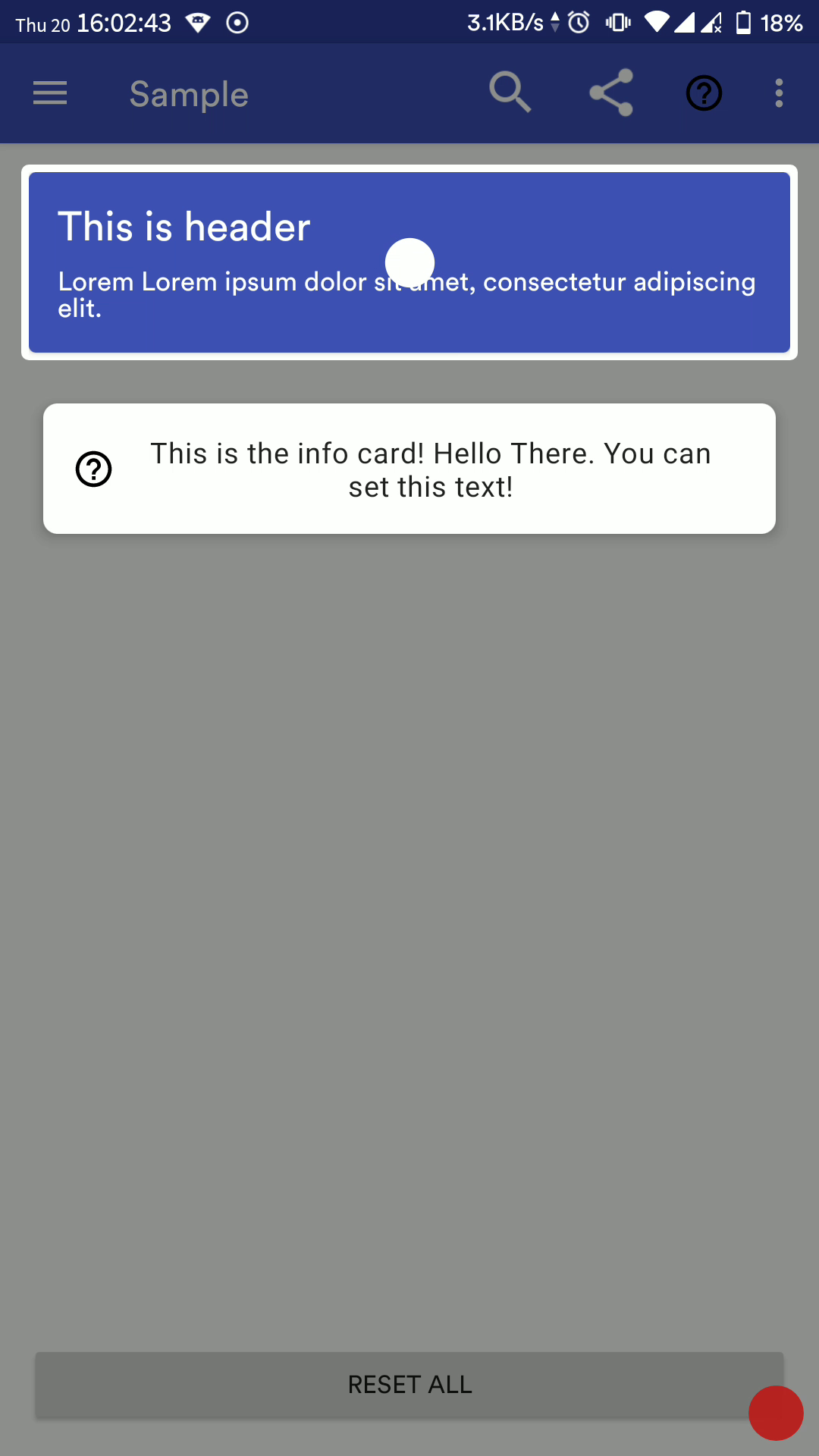
Screenshot
Sample APK can be found in the Releases Section
BREAKING
Upgrading to v2.2.0 will break your imports. This is because I have re-organized the extension methods. Please fix the imports by removing them from the import block and re-importing using Android Studio's Alt+Enter
Import
Through bintray
- Add to project-level build.gradle
buildscript {
  //...
}
allProjects {
  repositories {
    //...
    maven { url "https://dl.bintray.com/shripal17/codertainment" }
  }
}- Add to module-level build.gradle
dependencies {
  //...
  implementation 'com.codertainment.materialintro:materialintroview-v2:2.2.0'
}
Through JitPack
buildscript {
  //...
}
allProjects {
  repositories {
    //...
    maven { url "https://jitpack.io" }
  }
}- Add to module-level build.gradle
dependencies {
  //...
  implementation 'com.github.shripal17:MaterialIntroView-v2:2.2.0'
}
Changelog
Please check Releases
Single Usage in Activity/Fragment
val miv = materialIntro(show = true /* if you want to show miv instantly */) {
      maskColor = Color.BLUE
      delayMillis = 300

      isFadeInAnimationEnabled = true
      isFadeOutAnimationEnabled = true
      fadeAnimationDurationMillis = 300

      focusType = Focus.ALL
      focusGravity = FocusGravity.CENTER

      padding = 24 // in px

      dismissOnTouch = false

      isInfoEnabled = true
      infoText = "Hello this is help message"
      infoTextColor = Color.BLACK
      infoTextSize = 18f
      infoTextAlignment = View.TEXT_ALIGNMENT_CENTER
      infoTextTypeface = Typeface.DEFAULT_BOLD
      infoCardBackgroundColor = Color.WHITE

      isHelpIconEnabled = true
      helpIconResource = R.drawable.your_icon
      helpIconDrawable = yourDrawable
      helpIconColor = Color.RED

      infoCustomView = yourViewHere
      infoCustomViewRes = R.layout.your_custom_view_here

      isDotViewEnabled = true
      isDotAnimationEnabled = true
      dotIconColor = Color.WHITE

      viewId = "unique_id" // or automatically picked from view's tag
      targetView = viewToBeFocusedHere

      isPerformClick = false

      showOnlyOnce = true
      userClickAsDisplayed = true

      shapeType = ShapeType.CIRCLE
    }
// if you want to show it later
miv.show(activity)
Properties
| Name | Description | Default Value |
|---|---|---|
| maskColor | The background color | 46% Transparent |
| delayMillis | Delay in ms for MIV (MaterialIntroView) to be shown | 500 |
| isFadeInAnimationEnabled | Enable fade-in animation for MIV | true |
| isFadeOutAnimationEnabled | Enable fade-out animation for MIV | true |
| focusGravity | FocusGravity.CENTER, FocusGravity.LEFT or FocusGravity.RIGHT | FocusGravity.CENTER |
| focusType | Focus.ALL, Focus.MINIMUM or Focus.NORMAL | Focus.NORMAL |
| padding | Padding (in px) for focusing the target view | 10 |
| dismissOnTouch | Dismiss intro when user touches anywhere | false |
| isInfoEnabled | Whether to show info CardView | true |
| infoText | Text (CharSequence) to be displayed in info CardView | Empty Text |
| infoTextColor | Text Color for info text | textColorPrimary |
| infoTextSize | Text size in sp for info text | 16sp |
| infoTextAlignment | Text alignment for info text | View.TEXT_ALIGNMENT_CENTER |
| infoTextTypeface | Custom typeface for info text | Typeface.DEFAULT |
| infoCardBackgroundColor | Info CardView background color | Inherit from active theme |
| isHelpIconEnabled | Whether to show the help icon in Info CardView | true |
| helpIconColor | Tint help Icon | Black |
| helpIconResource | Custom drawable Resource for help icon | NA |
| helpIconDrawable | Custom drawable for help icon | NA |
| infoCustomView | Custom view to be displayed inside info CardView | NA |
| infoCustomViewRes | Custom layout resource id to be inflated inside CardView | NA |
| isDotViewEnabled | Whether to show a dot at the centre of focus view | true |
| isDotAnimationEnabled | Whether to zoom-in and zoom-out dot icon periodically | true |
| dotIconColor | Tint Dot Icon | textColorPrimaryInverse |
| viewId | Unique ID of View so that MIV doesn't show again 2nd time onwards (if showOnlyOnce is enabled) | Automatically picked from view's tag |
| targetView | View to be focused on | NA |
| isPerformClick | Click on the focused view when dismissing | false |
| showOnlyOnce | MIV should be shown only once | true |
| userClickAsDisplayed | MIV should be set as displayed only when user dismisses MIV manually, else MIV will be set as displayed as soon as it is rendered | true |
| shapeType | ShapeType.CIRCLE or ShapeType.RECTANGLE | ShapeType.CIRCLE |
| customShape | Use custom shape (Usage to be updated) | NA |
| materialIntroListener | Callback when user dismisses a view or it is not shown because it was set as displayed | Current activity/fragment if it implements MaterialIntroListener |
| skipLocation | Location of skip button on the screen SkipLocation.BOTTOM_LEFT or SkipLocation.BOTTOM_RIGHT or SkipLocation.TOP_LEFT or SkipLocation.TOP_RIGHT | SkipLocation.BOTTOM_LEFT |
| skipText | Skip Button Text | "Skip" |
| skipButtonStyling | Custom styling to be applied for the skip button (lambda function as member val) | NA |
Listener
In your activity/fragment:
class GravityFragment : Fragment(), MaterialIntroListener {
  /**
   * @param onUserClick is true when MIV has been dismissed through user click, false when MIV was previously displayed and was set as saved
   * @param viewId Unique ID of the target view
   */
  override fun onIntroDone(onUserClick: Boolean, viewId: String) {
    // your action here
  }
  //...
}
Configuration Method
//Create global config instance to not write same config again and again.
val config = MaterialIntroConfiguration().apply {
      maskColor = Color.BLUE
      delayMillis = 300

      isFadeInAnimationEnabled = true
      isFadeOutAnimationEnabled = true
      fadeAnimationDurationMillis = 300

      focusType = Focus.ALL
      focusGravity = FocusGravity.CENTER

      padding = 24 // in px

      dismissOnTouch = false

      isInfoEnabled = true
      infoText = "Hello this is help message"
      infoTextColor = Color.BLACK
      infoTextSize = 18f
      infoTextAlignment = View.TEXT_ALIGNMENT_CENTER
      infoTextTypeface = Typeface.DEFAULT_BOLD
      infoCardBackgroundColor = Color.WHITE

      isHelpIconEnabled = true
      helpIconResource = R.drawable.your_icon
      helpIconDrawable = yourDrawable
      helpIconColor = Color.RED

      infoCustomView = yourViewHere
      infoCustomViewRes = R.layout.your_custom_view_here

      isDotViewEnabled = true
      isDotAnimationEnabled = true
      dotIconColor = Color.WHITE

      viewId = "unique_id" // or automatically picked from view's tag
      targetView = viewToBeFocusedHere

      isPerformClick = false

      showOnlyOnce = true
      userClickAsDisplayed = true

      shapeType = ShapeType.CIRCLE

      // skip customisations are only used when showSkip = true is set in MaterialIntroSequence
      skipLocation = SkipLocation.TOP_RIGHT
      skipText = "Skip"
      skipButtonStyling = {
        // apply custom styling for https://material.io/develop/android/components/buttons/ here
        // strokeWidth = 5
        // setBackgroundColor(ContextCompat.getColor(requireContext(), R.color.colorAccent))
      }
}
materialIntro(config = config)
Sequence (Added in v2.1.0)
Using MaterialIntroSequence, you can create a flow for intro view easily in your activity/fragments. Suppose your activity has multiple fragments and each fragment has some or the other view on which you want to show MIV but you want a specific sequence to be followed. In such cases, MaterialIntroSequence is your savior!
The usage is quite simple, call the extension function from your activity/fragment and add MaterialIntroConfiguration objects to it:
class YourFragment: Fragment(), MaterialIntroSequenceListener {

  //...

  override fun onResume() {
    super.onResume()
    /**
    * Create/get MaterialIntroSequence for the current fragment's activity
     *
     * If your Activity/Fragment implements MaterialIntroSequenceListener, it is automatically assigned as materialIntroSequenceListener for the current created instance
     *
     * @param initialDelay delay for the first MIV to be shown
     *
     * @param materialIntroSequenceListener listener for MaterialIntroSequence events
     *
     * @param showSkip Whether to show the skip button for MIVs
     *
     * @param persistSkip If enabled, once the user clicks on skip button, all new MIVs will be skipped too, else even after the user clicks on skip
     * button and new MIVs are added after that, for e.g. for another fragment, the new MIVs will be shown
     */
    materialIntroSequence(initialDelay = 1000, showSkip = true, persistSkip = true) {
      addConfig {
        viewId = "viewId1"
        infoText = "Help for viewId1"
        infoCardBackgroundColor = Color.GREEN
        helpIconColor = Color.BLUE
        infoTextColor = Color.BLACK
        dotIconColor = Color.RED
        targetView = view1

        skipLocation = SkipLocation.TOP_RIGHT
        skipText = "Skip"
        skipButtonStyling = {
          // apply custom styling for https://material.io/develop/android/components/buttons/ here
          // strokeWidth = 5
          // setBackgroundColor(ContextCompat.getColor(requireContext(), R.color.colorAccent))
        }
      }
      addConfig {
        viewId = "viewId2"
        infoText = "Help for viewId2"
        infoCardBackgroundColor = Color.GREEN
        helpIconColor = Color.BLUE
        infoTextColor = Color.BLACK
        dotIconColor = Color.RED
        targetView = view2

        skipLocation = SkipLocation.TOP_RIGHT
        skipText = "Skip"
        skipButtonStyling = {
          // apply custom styling for https://material.io/develop/android/components/buttons/ here
          // strokeWidth = 5
          // setBackgroundColor(ContextCompat.getColor(requireContext(), R.color.colorAccent))
        }
      }
    }
  }

  /**
   * @param onUserClick if the MIV was dismissed by the user on click or it was auto-dismissed because it was set as displayed
   * @param viewId viewId for the dismissed MIV
   * @param current index of the dismissed MIV
   * @param total Total number of MIVs in the current MaterialIntroSequence
   */
  override fun onProgress(onUserClick: Boolean, viewId: String, current: Int, total: Int) {
    toast("click: $onUserClick\nviewId: $viewId\ncurrent: $current\ntotal: $total")
  }

  /**
   * Called when all MIVs in the current MaterialIntroSequence have been dismissed
   */
  override fun onCompleted() {
    toast("Tutorial Complete")
  }
}
Use Custom Shapes
You can use your own highlight shapes if Circle and Rectangle do not work for you. See source for Circle and Rect for implementation example.
TODO update doc
More Screenshots
| Default config | Right align gravity | RecyclerView item |
|---|---|---|
 |  |  |
| Focus All | Focus Minimum | Focus Normal |
|---|---|---|
 |  |  |
| Toolbar Item with sequence and custom colors | Custom Info View using resource layout | Custom Info View at runtime |
|---|---|---|
 |  |  |
| Sequence with multiple fragments | Skip Button at Bottom Right Position with dotIconColor partially transparent | Skip Button at Top Right position |
|---|---|---|
 |  |  |
Full Demo GIF

Authors
Showcase
Apps using this library
Create a new issue to add your app here
License
Copyright 2020 Shripal Jain

Licensed under the Apache License, Version 2.0 (the "License");
you may not use this file except in compliance with the License.
You may obtain a copy of the License at

   http://www.apache.org/licenses/LICENSE-2.0

Unless required by applicable law or agreed to in writing, software
distributed under the License is distributed on an "AS IS" BASIS,
WITHOUT WARRANTIES OR CONDITIONS OF ANY KIND, either express or implied.
See the License for the specific language governing permissions and
limitations under the License.