

Submarine
Fully customizable floating navigation view for listing items dynamically on Android.

Including in your project
Gradle
Add the codes below to your root build.gradle file (not your module build.gradle file).
allprojects {
    repositories {
        mavenCentral()
    }
}
And add the dependency below to your module's build.gradle file.
dependencies {
    implementation "com.github.skydoves:submarine:1.0.7"
}
SNAPSHOT
Snapshots of the current development version of submarine are available, which track the latest versions.
repositories {
   maven { url 'https://oss.sonatype.org/content/repositories/snapshots/' }
}
Usage
Add following XML namespace inside your XML layout file.
xmlns:app="http://schemas.android.com/apk/res-auto"SubmarineView
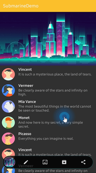
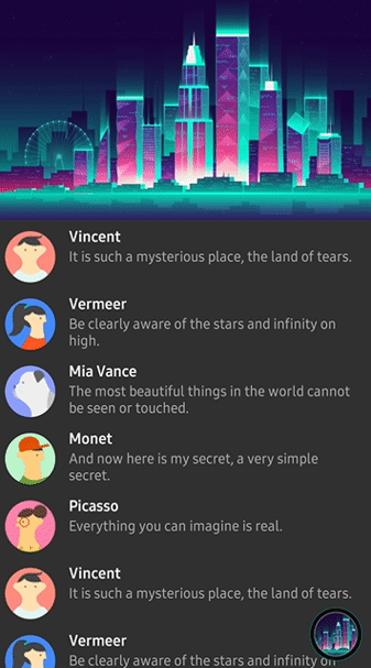
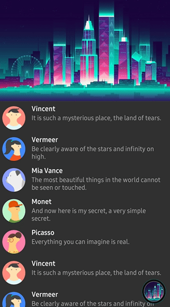
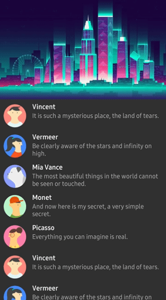
Here is how to implement like previews using SubmarineView.
<com.skydoves.submarine.SubmarineView
android:id="@+id/submarineView"
android:layout_width="50dp" // this will not affect on real view size. We can set anything.
android:layout_height="50dp" // this will not affect real view size. We can set anything.
android:layout_alignParentBottom="true"
android:layout_margin="20dp"
android:alpha="0.8"
app:submarine_animation="scale" // floating, dipping animation style.
app:submarine_borderColor="@color/colorPrimaryDark" // navigation's border color.
app:submarine_borderSize="1dp" // navigation's border thickness.
app:submarine_circleAnchor="right" // decides where to moves the circle icon.
app:submarine_circleBorderColor="@color/green" // circle icon's border color.
app:submarine_circleBorderSize="1dp" // circle icon's border thickness.
app:submarine_circleDrawable="@drawable/picasso" // circle icon's image drawable.
app:submarine_circlePadding="2dp" // circle icon's padding value.
app:submarine_circleSize="22dp" // circle icon's size. It decides the height or width of navigation.
app:submarine_color="@android:color/black" // navigation's background color.
app:submarine_duration="350" // navigation spreading duration.
app:submarine_orientation="horizontal" // navigation spreading orientation.
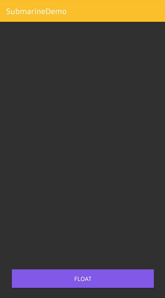
/>Float and Dip
Shows and makes disappear using the below methods.
submarineView.floats() // shows
submarineView.dips() // makes disappear
Navigate and Retreat
We can make the SubmarineView always floating (without appear, disappear actions) and navigating when we want.
Firstly, add below attributes to SubmarineView on your xml file.
app:submarine_autoDip="false"
app:submarine_autoNavigate="false"
And call floats() method before using navigates() method.
submarineView.floats()Unfold and fold using the below methods.
submarineView.navigates() // unfold
submarineView.retreats() // fold
SubmarineItem
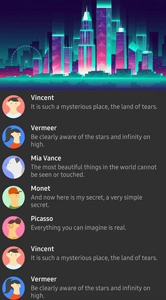
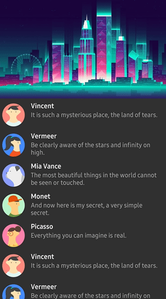
SubmarineItem is a data class for composing navigation list.
val item = SubmarineItem(ContextCompat.getDrawable(this, R.drawable.ic_edit))
submarineView.addSubmarineItem(item)
We can customize the icon drawable using IconForm.Builder.
val iconForm = IconForm.Builder(context)
  .setIconSize(45)
  .setIconTint(ContextCompat.getColor(context, R.color.colorPrimary))
  .setIconScaleType(ImageView.ScaleType.CENTER)
  .build()

// kotlin dsl
val iconForm = iconForm(context) {
  iconSize = 45
  iconColor = ContextCompat.getColor(context, R.color.colorPrimary)
  iconScaleType = ImageView.ScaleType.CENTER
}

val item = SubmarineItem(ContextCompat.getDrawable(this, R.drawable.ic_edit), iconForm)
submarineView.addSubmarineItem(item)
We can add SubmarineItem list, remove and clear all items.
submarineView.addSubmarineItem(item) // adds a SubmarineItem item.
submarineView.addSubmarineItems(itemList) // adds a SubmarineItem item list.
submarineView.removeSubmarineItem(item) // removes a SubmarineItem item.
submarineView.clearAllSubmarineItems() // clears all SubmarineItem items.
SubmarineItemClickListener
Interface definition for a callback to be invoked when a item is clicked.
submarineView.submarineItemClickListener = onItemClickListener

private object onItemClickListener: SubmarineItemClickListener {
  override fun onItemClick(position: Int, submarineItem: SubmarineItem) {
    // doSomething
  }
}
Circle Icon
We can customize the circle icon on the navigation.
Submarine uses CircleImageView. So you can reference the usage of it.
submarineView.circleIcon.setImageDrawable(drawable) // gets circle icon and changes image drawable.
submarineView.circleIcon.borderColor = ContextCompat.getColor(context, R.color.colorPrimary) // gets circle icon and changes border color.
submarineView.circleIcon.borderWidth = 2 // gets circle icon and changes border width.
SubmarineCircleClickListener
Interface definition for a callback to be invoked when a circle icon is clicked.
submarineView.submarineCircleClickListener = onCircleIconClickListener

private object onCircleIconClickListener: SubmarineCircleClickListener {
  override fun onCircleClick() {
    // doSomething
  }
}
Orientation and Anchor
SubmarineOrientation and CircleAnchor decide the where to spreads and where to moves.
app:submarine_circleAnchor="right" // left, right, top, bottom
app:submarine_orientation="horizontal" // horizontal, vertical| Horizontal and Left | Horizontal and Right | Vertical and Top | Vertical and Bottom |
|---|---|---|---|
 |  |  |  |
SubmarineAnimation
SubmarineAnimation decides the animation of float and dip methods.
app:submarine_animation="scale" // scale, fade, none| SCALE | FADE |
|---|---|
|  |
SubmarineView Attributes
| Attributes | Type | Default | Description |
|---|---|---|---|
| orientation | SubmarineOrientation | Horizontal | navigation's spreading orientation. |
| duration | Long | 350L | navigation's spreading duration. |
| color | Int(Color) | Color.Black | navigation's background color. |
| animation | SubmarineAnimation | None | floating, dipping animation style. |
| borderSize | Dimension | 0f | navigation's border thickness. |
| borderColor | Int(Color) | Color.Green | navigation's border color. |
| expandSize | Dimension | display width size - 20dp size | navigation's width or height size after expands. |
| radius | Dimension | 15dp | navigation's corder radius. |
| autoNavigate | Boolean | true | executes navigate method automatically after executing float method. |
| autoDip | Boolean | true | executes dip method automatically after executing retreat method. |
| circleAnchor | CircleAnchor | Left | decides where to moves the circle icon. |
| circleSize | Dimension | 20dp | circle icon's size. It decides the height or width of navigation. |
| circleDrawable | Drawable | null | circle icon's image drawable. |
| circleBorderSize | Dimension | 0f | circle icon's border thickness. |
| circleBorderColor | Int(Color) | 0f | circle icon's border color. |
| circlePadding | Dimension | 0f | circle icon's padding width. |
Find this library useful? ❤️
Support it by joining stargazers for this repository.
License
Copyright 2019 skydoves (Jaewoong Eum)

Licensed under the Apache License, Version 2.0 (the "License");
you may not use this file except in compliance with the License.
You may obtain a copy of the License at

   http://www.apache.org/licenses/LICENSE-2.0

Unless required by applicable law or agreed to in writing, software
distributed under the License is distributed on an "AS IS" BASIS,
WITHOUT WARRANTIES OR CONDITIONS OF ANY KIND, either express or implied.
See the License for the specific language governing permissions and
limitations under the License.